UK Watch Forum banner

Breitling Superocean 44 .... oh dear !

2.7K views 7 replies 7 participants last post by  Iceblue  
#1 ·
a17367021i1a1.png


I tried on this today and to say I am underwhelmed in an understatement.

I think it was @JoT who originally posted the launch pictures of these some months back and reactions were not positive.

I finally got to try one on and lets just say it just does not work.

The immediately obvious problem is that the rubberised bezel just looks out of place and makes the watch appear "flat" , it robs the dial of depth of field and looses the focus. This would have been a much much better watch on a steel bezel..

Size wise it was perfect , wears smaller than its 44mm suggests and its comfortable beyond reason. No doubt technically its as great as Breitling watches usually are, but for me the aesthetics just don't hold together. Thought out of the new SOs I would really like this one alone, but nope... big backwards step from them for this iconic model family.
 
#2 ·
that's a shame john as first impressions suggest it should be a winner, although i must admit I am not sure about the symmetry with the12,6 ,9 and missing 3 if you know what I mean,

deano
 
#3 ·
I once lusted after the older yellow Super Oceans, but I don't like that new one. :thumbdown:

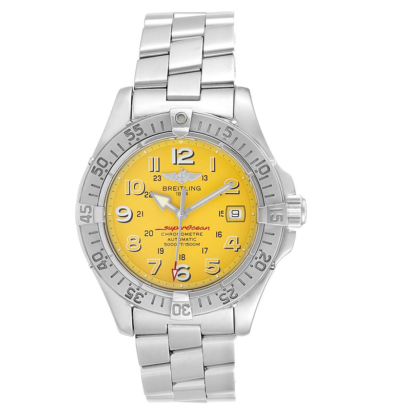
[IMG alt="Image result for Breitling yellow superocean" data-ratio="150.33"]https://ncgm.imgeng.in/https://www.bernardwatch.com/image/archive/brt1859.jpg[/IMG][IMG alt="Image result for Breitling yellow superocean" data-ratio="100.00"]https://cdn.theluxurycloset.com/uploads/products/full/luxury-men-breitling-used-watches-p231152-009.jpg[/IMG]
 
#4 ·
I think the two older yellow models as shown above are far classier the new model. The numbers and markers in the new model are two big and bold and the font type is half way to being comical. . They needed to be smaller and toned down a bit. If they were designed for a racing watch, then fair enough, but not on a diver. There's little symmetry in the overall design and everything just clashes. A black bezel should enhance the look of the dial but it's been beaten into submission by the dominating numerals and markers. It takes some skill to get what should be a classic design and style of watch so wrong, but that's what they have achieved.
 
#6 ·
Yes , this hits the nail on the head I think .....

I think the two older yellow models as shown above are far classier the new model. The numbers and markers in the new model are two big and bold and the font type is half way to being comical. . They needed to be smaller and toned down a bit. If they were designed for a racing watch, then fair enough, but not on a diver. There's little symmetry in the overall design and everything just clashes. A black bezel should enhance the look of the dial but it's been beaten into submission by the dominating numerals and markers. It takes some skill to get what should be a classic design and style of watch so wrong, but that's what they have achieved.
It's perhaps the "strategy" of the company to compete against other brands ... but they surely must stick to their heart and soul.